Towards Crowdsourced Tracking Data?
Over the past few months I have gone down a rabbit hole trying to work out what would be necessary to produce crowdsourced, publicly available tracking data. In this post I want to take stock of my progress so far, give an overview of the Narya API (an open-source computer vision API trained on broadcast footage) and introduce two possible applications. With a growing analytics community there is ever more demand for more publicly available data and in particular tracking data.
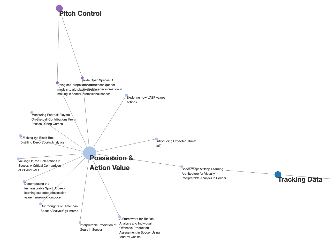
Introducing: Soccer Analytics Library
As many year-end Twitter threads have highlighted: 2020 was a great year for soccer analytics. New open-sourced data sets have enabled a new wave of amateur content, while ever more sophisticated research is published by clubs, data providers and universities around the world. Having followed the space for a few years now it becomes increasingly difficult to follow and digest all relevant research. James Yorke, who obviously has much more experience and a better overview on research then me, already raised a similar concern more than a year ago.
Do Naive xG Models underestimate Expected Goals for Top Teams?
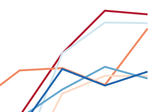
After documenting the implementation of a simple xG model I have spent quite a bit of time thinking about what makes a good model and how you could go about quantifying its quality. Coincidentally, a few weeks ago Tom Worville posted the below chart which sparked a bit of a discussion around the relationship between high shooting output and overperformance of xG. Look at how clinical Son's been in terms of scoring above expected (t/t @Torvaney for the gridline idea here) pic.
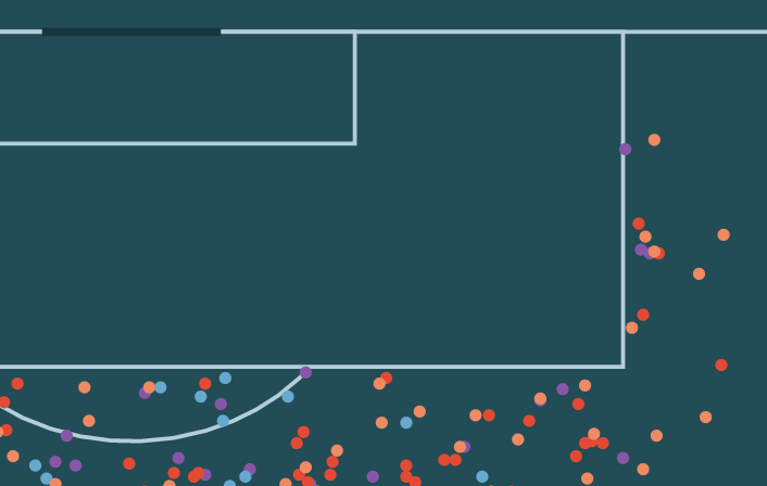
First Look at SkillCorner's Open Source Tracking Dataset
A couple of weeks ago another great dataset was made available to the soccer analytics community. In collaboration with Friends-of-Tracking the data provider SkillCorner open-sourced tracking data for nine matches across the Top5 leagues. Here is the link of the 9 matches of broadcast tracking data, we're open sourcing today:https://t.co/4CnxCO1EAC We'll open source soon some tooling to help visualizing the data, computing derivatives or synchronizing the data with event data.

xG Model - Accuracy and Goodness-Of-Fit
In the first part of this series we constructed a simple expected Goals-model, solely relying on two predictors: the distance and angle from goal for each shot. As a reminder see below the visualization of our xG-estimates from the first part of this series: Our model passed the eye test, i.e. it maps shot locations to xG-values that make intuitive sense to us. In this post we want to evaluate the quality of this model more formally with tidymodels’ yardstick package.
xG Model - Design and Implementation with R Tidymodels
I have recently gone through the Google Machine Learning crash course and was looking for a project to apply these skills to. Coincidentally, it is also not that long ago that tidymodels has gained some traction (at least in my twitter feed) and I am keen to try it out. Of course an Expected Goals-model is a great excuse to combine the two items above. It is relatively easy to set up, readers of this blog will not need a lengthy introduction to the thought process behind it and the feature set used to explain the probability of shots leading to goal is very intuitive.
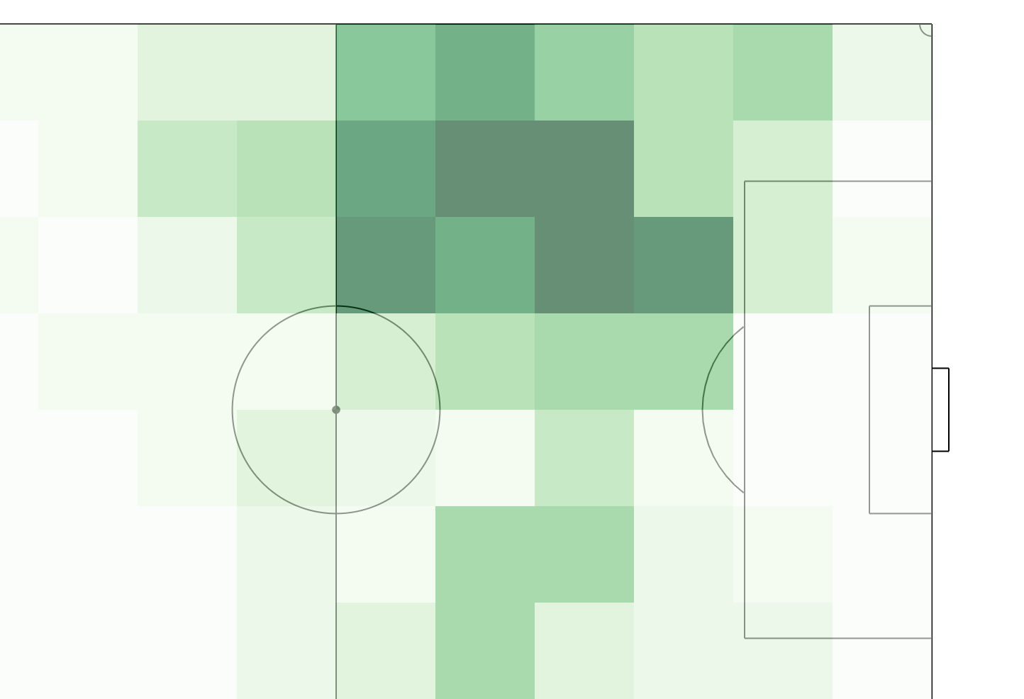
Combining D3 and R for a Messi Pass Transition Heatmap
In this post I want to show off a nice feature of R that let’s you combine d3 and R workflows flawlessly to generate powerful visualizations. In this crossover of languages, R will take the role of data loading and manipulation while d3 focuses on producing the visualization. Below shows step-by-step how to generate the following pass transition heatmap based on free StatsBomb event data.

Injury Polar Plots
Injury data has been a bit of a guilty pleasure for me recently. When browsing through some of the data from Transfermarkt I looked into different ways of visualizing it. Specifically I was focused on highlighting injury lengths and their distribution over a player’s career. Screenshot from transfermarkt.com This resulted in the below viz for Marco Reus which is inspired by how I view the (European) football calendar: running counter-clockwise and with the summer break at 6 o’clock.
Lionel Messi - Free Kick Dashboard
I finally had some time to play around with the free Statsbomb data. I previously wanted to look into using the crosstalk package to link interactive charts and this data set which includes all of Messi’s La Liga free kicks gave me a good excuse. Launch Dashboard The initial idea was to link the location of free kicks to their goal impact (or their impact outside of the goal as long as they are not blocked).
Quantifying Injury Rates
Being a Bayern Munich supporter, injuries have been a big part of past campaigns. During most of the past season (2017/2018) Manuel Neuer was injured with a broken foot. For the second match against Real Madrid in the Champions League semi finals the team had to additionally compensate the injuries of Jérôme Boateng, Arturo Vidal, Kingsley Coman and Arjen Robben. While Pep Guardiola was still coach at Bayern his dispute with the long-serving team doctor Mueller-Wohlfahrt culminated into him resigning after 38 years with the team (Mueller-Wohlfahrt was later reinstated in 2017).
Is possession data getting more extreme?
The possession metric is probably one of the football statistics which is cited most often. It has gained even more media attention since we have seen larger divergence in possession across teams. Oversimplified game approaches of teams are often broadly categorized between possession-oriented and counter-attacking: think about Barcelona/Bayern Munich/Manchester City vs Chelsea/Borussia Dortmund/Liverpool. At first glance the possession statistic seems to be fairly trivial: who controls most of the ball during the 90 minutes?