Injury Polar Plots
Injury data has been a bit of a guilty pleasure for me recently. When browsing through some of the data from Transfermarkt I looked into different ways of visualizing it. Specifically I was focused on highlighting injury lengths and their distribution over a player’s career.
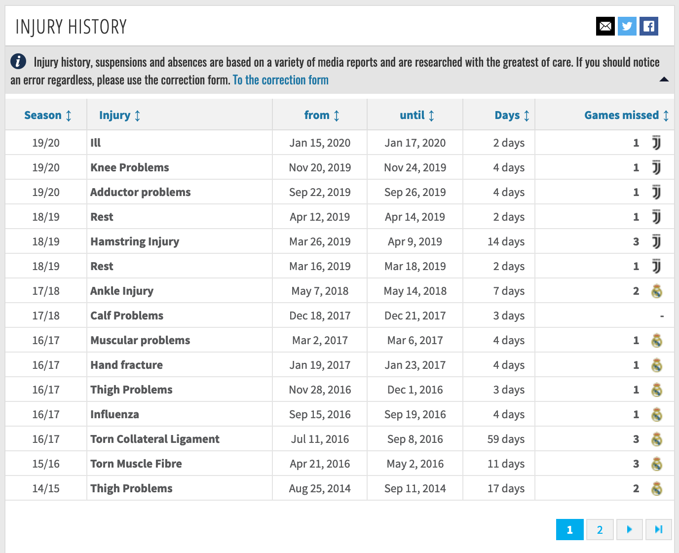
Screenshot from transfermarkt.com
This resulted in the below viz for Marco Reus which is inspired by how I view the (European) football calendar: running counter-clockwise and with the summer break at 6 o’clock.
Each ring in the polar plot corresponds to one season moving from the first season on the inside to the most recent season as the outer ring. On the right half there is some space for a player portrait, some commentary and an overview on missed games per season.
A second version of this viz in true black & yellow with annotations and background on the numbers of games missed by season. Still unsure about the color for healthy periods... #RStats #BVB pic.twitter.com/0dnSEzUZUZ
— Lars M (@thesignigame) May 24, 2020
Form Over Function
Looking at the polar chart it is clear that it looks appealing (at least in my view), but it is hard to read. I do not think that it is hard to understand what is shown on a high level, but following individual seasons by ring or comparing injury durations across seasons is very hard. In other words it commits the cardinal sin of prioritizing form over function.
Even the CRAN documentation for the coord_polar function explicitly warns of this and they are not subtle about it:
NOTE: Use these plots with caution - polar coordinates has major perceptual problems. The main point of these examples is to demonstrate how these common plots can be described in the grammar. Use with EXTREME caution (from documentation of coord_polar {ggplot2}).
Bar Chart Representation
A more conservative approach to representing this data is to use a bar chart. This choice addresses the two problems highlighted above but definitely reduces the visible appeal. See below for Holger Badstuber:
And the more readable version pic.twitter.com/IN2z3d1MQf
— Lars M (@thesignigame) May 24, 2020
How To Construct These Plots
Above visualizations are entirely produced in R without any manual steps. I will outline below how to replicate them with the example of Cristiano Ronaldo and we’ll start with loading the necessary libraries.
library(tidyverse) # ggplot and table manipulations
library(lubridate) # handling of date logic
library(cowplot) # plotting the player portrait
library(glue) # neccessary to style the title
library(ggtext) # neccessary to style the title
library(patchwork) # allows us to combine plots
library(kableExtra) # nice html table formatting
At the very top of this post you already see the kind of data that Transfermarkt provides for Cristiano Ronaldo. The next step is to bring them into a format that allows us keep healthy and injured periods separated.
We achieve this by adding a dummy column with unique names for each healthy or injured period. If we simply all call them healthy or injured ggplot will group them all together and we cannot keep the original order of dates.
The day_diff column measures the duration of each period and counts from August 1st for the first period of each season.
The dataframe we are feeding into ggplot now looks like the below. The code to produce this systematically is quite involved so I won’t spell it out here. Of course this can also produced manually.
| injury | season | from | to | day_diff | dummy | color |
|---|---|---|---|---|---|---|
| Healthy | 2002/2003 | NA | NA | 334 | Healthy_2002/2003 | grey80 |
| Summer_Break | 2002/2003 | NA | NA | 31 | Summer_Break_2002/2003 | grey10 |
| Healthy | 2003/2004 | NA | NA | 334 | Healthy_2003/2004 | grey80 |
| Summer_Break | 2003/2004 | NA | NA | 31 | Summer_Break_2003/2004 | grey10 |
| Healthy | 2004/2005 | NA | NA | 334 | Healthy_2004/2005 | grey80 |
| Summer_Break | 2004/2005 | NA | NA | 31 | Summer_Break_2004/2005 | grey10 |
In the following chunk we are now plotting our polar plot. The plot is initially based on a simple geom_bar function but is then transformed into a polar plot through coord_polar at the very end.
A few comments on the coord_polar parameters: start is quoted in radians and specifies where in the circle your chart should start. The choice of -1 for direction ensures that the charts plots counter-clockwise.
The code below also contains a little hack that allows us to insert some space at the very center of the circle. In scale_x_discrete we concatenate some dummy string variables to our actual season vector. We won’t see any data plotted there but can so control the minimum radius of our first season.
# Define order of data being plotted and extract a vector of seasons

data_plot$dummy <- factor(data_plot$dummy, levels = rev(data_plot$dummy))
seasons <- data_plot %>% distinct(season) %>% pull(season)

# Most of the heavy lifting happens in the five lines below

plot <- ggplot(data_plot, aes(x = season, y = day_diff, fill = dummy)) +
  geom_bar(width = 0.5, stat = "identity") +
  scale_x_discrete(limits = c("dummy", "dummy", "dummy", "dummy", "dummy",
                              seasons,
                              "annotation")) +
  scale_fill_manual(values = tibble::deframe(data_plot %>% select(dummy, color))) +
  coord_polar(theta = "y", start = 6.5/6*pi, direction = -1)

# Followed by some annotations and cleaning up of the theme

plot <- plot +
  annotate("text",
           x = "annotation",
           y = 331,
           colour = text_col,
           size = 2,
           label = "June|",
           angle = 340,
           fontface = 2) +
  annotate("text",
           x = "annotation",
           y = 5,
           colour = text_col,
           size = 2,
           label = "|August",
           angle = 20,
           fontface = 2) +
  theme_void() +
  labs(title =
         glue::glue("{player_name} - <b style = 'color:{highlight_col}'>Injury</b> History")) +
  theme(panel.background = element_rect(fill = background_col, color = background_col)) +
  theme(plot.background = element_rect(fill = background_col, color = background_col)) +
  theme(plot.title = element_text(size = 14, color = text_col)) +
  theme(legend.position = "none", plot.title = element_markdown(hjust = 0.5)) +
  theme(axis.title.x = element_blank(),
        axis.title.y = element_blank(),
        axis.text.x = element_blank(),
        axis.text.y = element_blank(),
        axis.ticks.x = element_blank(),
        axis.ticks.y = element_blank())

# Finally we are adding the label for each season

for(season in seasons){
  plot <- plot +
    annotate("text",
             x = season,
             y = 350,
             colour = text_col,
             size = 1.5,
             label = paste0(substr(season, 3, 4), "/", substr(season, 8, 9)),
             fontface = 2)
}

plot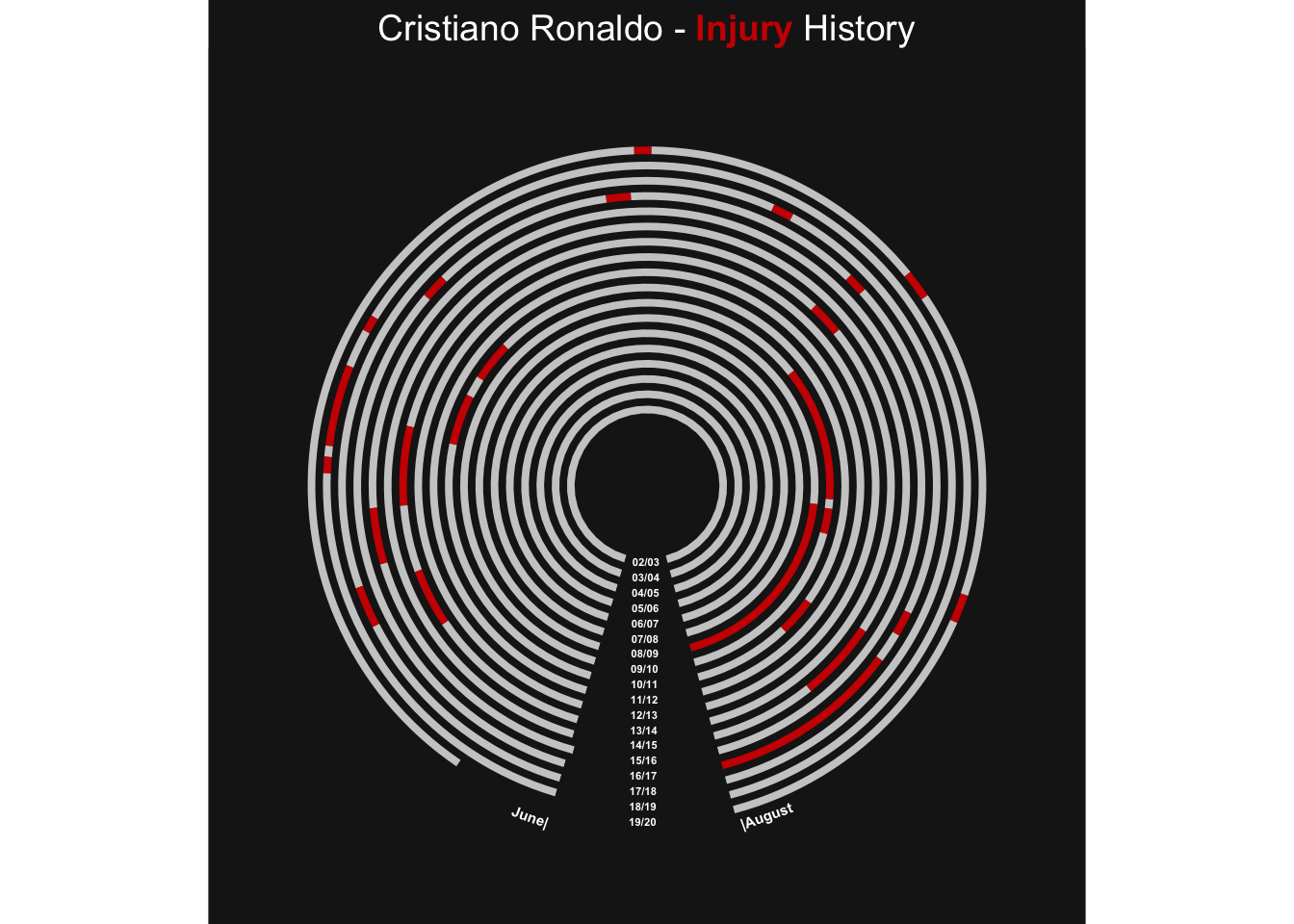
Once we have our polar plot we can combine it some more background information: a player portrait, some commentary and another ggplot chart. To achieve this we make use of the patchwork-package. With the help of this elegant package combining these four elements is literally a one-liner:
plot + (img_plot / txt_plot / missed_plot).
img_plot <- ggplot() +
  theme_void() +
  theme(panel.background = element_rect(fill = background_col, color = background_col)) +
  theme(plot.background = element_rect(fill = background_col, color = background_col)) +
  xlim(0, 1) +
  ylim(0, 1) +
  draw_image(path_to_img, x = 0, y = 0.0, width = 1)

txt_plot <- ggplot() +
  theme_void() +
  theme(panel.background = element_rect(fill = background_col, color = background_col)) +
  theme(plot.background = element_rect(fill = background_col, color = background_col)) +
  xlim(0, 1) +
  ylim(0, 1) +
  annotate("text",
           x = 0,
           y = 1.0,
           colour = text_col,
           size = 2.5,
           hjust = 0,
           label = "-----------------------------------------------------------------") +
  annotate("text",
           x = 0,
           y = 0.8,
           colour = text_col,
           size = 2.5,
           hjust = 0,
           label = "- Remarkably resilient to injuries over his long career") +
  annotate("text",
           x = 0,
           y = 0.5,
           colour = text_col,
           size = 2.5,
           hjust = 0,
           label = "- Longest injury break during the season 2008/09 \n with a fractured kneecap") +
  annotate("text",
           x = 0,
           y = 0.2,
           colour = text_col,
           size = 2.5,
           hjust = 0,
           label = "- Only missed more than five games in four of 18 seasons") +
  annotate("text",
           x = 0,
           y = 0.0,
           colour = text_col,
           size = 2.5,
           hjust = 0,
           label = "-----------------------------------------------------------------")

plot + (img_plot / txt_plot / missed_plot)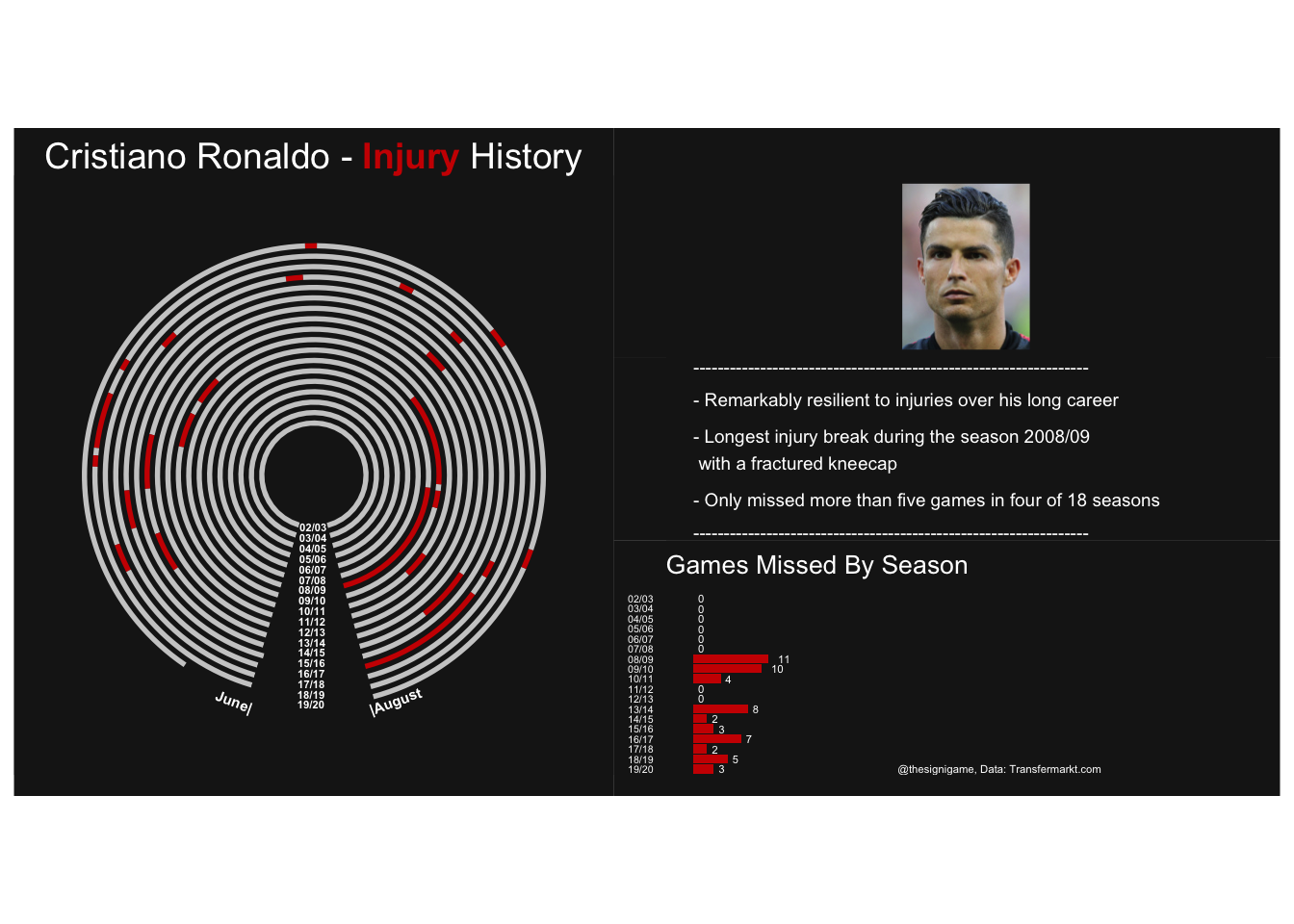
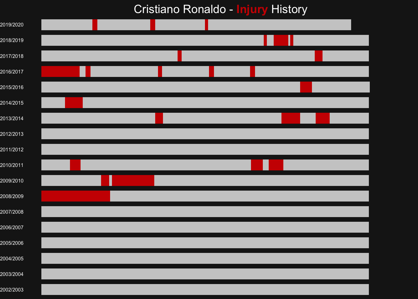
As mentioned above already we can also show the same data in a more readable, but visually less appealing form. Essentially this is the state of the plot before it is bent into a circle shape.
plot_bar <- ggplot(data_plot, aes(x = season, y = day_diff, fill = dummy)) +
  geom_col(width = 0.7) +
  scale_x_discrete(limits = seasons) +
  scale_fill_manual(values = tibble::deframe(data_plot %>% select(dummy, color))) +
  coord_flip()

plot_bar <- plot_bar +
  annotate("text",
           x = "annotation",
           y = 331,
           colour = text_col,
           size = 2,
           label = "June|",
           fontface = 2) +
  annotate("text",
           x = "annotation",
           y = 5,
           colour = text_col,
           size = 2,
           label = "|August",
           fontface = 2) +
  theme_void() +
  labs(title = glue::glue("{player_name} - <b style = 'color:{highlight_col}'>Injury</b> History")) +
  theme(panel.background = element_rect(fill = background_col, color = background_col)) +
  theme(plot.background = element_rect(fill = background_col, color = background_col)) +
  theme(plot.title = element_text(size = 14, color = text_col)) +
  theme(legend.position = "none", plot.title = element_markdown(hjust = 0.5)) +
  theme(axis.title.x = element_blank(),
        axis.title.y = element_blank(),
        axis.text.x = element_blank(),
        axis.text.y = element_text(size = 6, color = text_col),
        axis.ticks.x = element_blank(),
        axis.ticks.y = element_blank())

plot_bar